The Importance of Responsive Web Design in the Mobile-First Era
Did you know that over 50% of global web traffic now access websites from smartphones? And this number itself is enough to make it an alarming call for all businesses that are still relying on old tech website that runs only on desktops, without knowng the fact that their potential customers have shifted to mobile versions now.
As the number of cellphone users will grow, these conversational website search will change into a mobile search. No matter whether its about using facebook or Amazon for shopping or binance for performing financial transactions, a mobile-friendly website will take over all other devices.
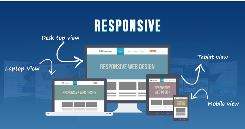
With a Responsive web design (RWD) users smohtly can operate different screen sizes and orientations without any hurdles. For e-business, a responsive website is no longer just a nice to have thing, but a crucial requirement.
In this write-up, we will explore the potential benefits of a mobile-first website and how you can reliably partner with web development services in US to help you achieve this.
Benefits of Having Mobile-Friendly Website Design
In 2025, we expect a widespread use of mobile devices compared to any other screen size. It will completely change the way users previously used to access the internet. In fact, recent stats have revealed that around 60% of people now browse the web using their phones or tablets, and the number is undoubtedly gonna grow. It has now persuaded around half of the websites globally to shift their focus on mobile phones rather than single desktop performance.
Improved User Experience (UX)
Websites that focus on self-interest rather than user interest have always failed to provide an easy-to-navigate working experience for visitors. What if a customer lands on your site and text is too small to read, images are all croped and they have to zoom in and out to perform intended purpose. Sounds frustrating? Right, thats exactly what happens when your site is not ready for use on smartphones.
Having a mobile-friendly website design will automatically adjust the screen based on user needs; they don’t have to crawl up and down to do all.
Better SEO Performance
Search engines globally, particularly Google, favor websites that are easy to use on small screens. In fact, Google uses mobile-first indexing, meaning it predominantly uses your website’s mobile version for ranking purposes. So, your SEO performance may suffer if your site isn’t optimized for mobile. It may cost you a loss of business and massive organic traffic.
With responsive website design, you can ensure that you have an exceptional user experience and its ranking on search engines, helping you target potential customers online.
Mobile Traffic is the New Norm
The number of mobile users currently globally is around 7.1 billion and its regularly growing with changing market demands. This simply implies that to users its a convent and first choice to work through small screens.
No matter whether you a running a eCommerce platforms or a crypo marketplace, if you feel like that your exisitngn website in not ready to support a large number of mobile user, with a lots of worris you might be loosing clients and business daily. A user friendly website ensures that your content looks great and functions well on smartphones, tablets, or wearables.
Increased Engagement and Conversions
When you have a user friendly website design visitors will stay longer to browse different and remain engaged with your content. This responsive design will the users to land on your website and seek for what they want without frustration of navigating a desktop layout on a smaller screen.
As a result, it brings higher lead conversion rates and several other lucrative possibilities. Whether you want users to sign up for a newsletter, make a purchase, or fill out a contact form with an appealing website experience, they will do it all happily.
Cost Efficiency and Easier Maintenance
Initialy the developers have to make a separate website for desktop and mobiles to ensure that it remain responsive. It usually cost them a lot two prepare two different versions of websites separately.
With the advancement of different technologies, they only need one website that works across all devices. This approach is cost-saving and makes it easy to update and maintain a website. Any updates you make to your site will automatically apply to both desktop and mobile users, saving you time and effort.
Future-Proofing Your Website
Future-proofing is the process of anticipating future trends and technologies that are more likely to dominate. Businesses that want to scale their websites for the long term will need a responsible web design to edge competitors in the future. This responsive web design will automatically adapt to future technologies and remain functional and user-friendly. Rather than redesigning every time, you revamp it when a new gadget hits the market.
Concluding
A responsive design in the future will help you with an enticing UI/UX, a surge in SEO rankings, and easy-to-update and maintain websites. It will be accessible and enjoyable for users regardless of the device they are on. The above benefits are enough to prove how a responsive web design can bring endless benefits. If you want to assess whether your site is capable enough to run smoothly on different devices, Don’t wait any longer. Hire an experienced firm for web development services in US now to get the most out of it.
Read more: Swift vs. Dart for iOS App Development
![[pii_email_d66aec8ab3772e6af11b]](https://techpostusa.com/wp-content/uploads/2022/03/pii_email_d66aec8ab3772e6af11b-390x205.png)

